
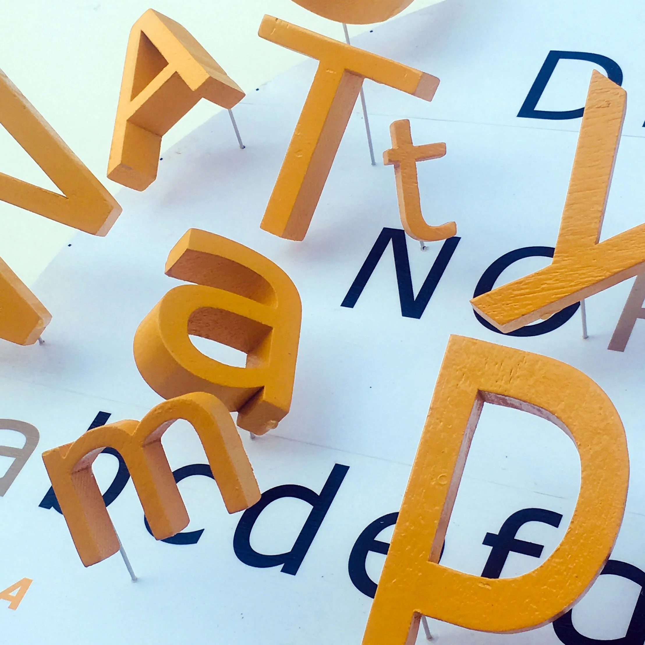
I love watching clouds wispily pass overhead. But wanting to represent them led me graphically towards forms I could cut out, stack, and arrange to gain depth. I chose to work in a cartoon-like style. To portray the imaginative nature of clouds, I didn’t need to restrict my pallet to whites and greys. I chose warm, playful colors. Since first hearing of UFOs, I imagined they might hide in clouds to observe humans. In fact, humans have spent millennia thinking about joining the clouds, about flying. As I researched the many ways people have attempted to fulfill this dream, I found da Vinci’s drawings of winged men and a helicopter, photos of early daredevil aeronauts and gas-filled zeppelins, rocket car toys, Charles Schulz’s Snoopy flying his doghouse, and a flying saucer. All the colors and images emphasized our desire to dream and build, so I added “imagine” in plastic letters.
DOGMATIC

Inclined to forcefully state facts as incontrovertibly true. Dogmatic has always made me frown and smile at the same time. I dislike people who seem unchangeable in their views, but the “dog” in dogmatic makes me think of dogs barking without a purpose other than to remind you they’re here and not to be messed with. In looking up the definition of dogmatic, I found that its root is dogma, which brought to mind forceful politicians, preachers, and patriots, and their extreme ideals. Each day when I go walking, I pass signs that warn BEWARE OF DOG. So, after searching online for images of barking dogs, reworking and editing them, I created a composite that emphasized the fierce, unbending nature of dogs barking and added the warning BEWARE OF DOGMA.
CLAPTRAP

Nonsensical verbiage uttered by a conman. My favorite example is the Looney Toons character Foghorn Leghorn, who could blather like a carnival barker. I wanted to evoke a circus atmosphere with this piece, each letter becoming its own colorful character. I cut the letters out of recycled mahogany, a fine-grained wood that could hold the twists, turns, edges, and corners of my various fonts. I developed color patterns for each letter to suggest the garments of jesters and clowns, and cut an oval shape from plywood for the baseboard, wrapping it in handmade paper embedded with string to add animation. A circus banner was added to each letter, emblazoned with a synonym for claptrap – flapdoodle, malarkey, tommyrot, poppycock, blather, codswallop, piffle, and looneytoon. And in the end, Foghorn had to join the ensemble.
CATTYWAMPUS
Not lined up or arranged correctly – like the items on a coffee table after a two year old has played with them. To represent this disrupted alignment graphically, I needed to first establish something in a proper order. Being a graphic designer, the alphabet came to mind – every letter needing to be in its proper place. I chose a circular format to keep the alphabet from feeling too static. While relying on its indisputable order, I selected the letters in CATTYWAMPUS to be the objects in disorder, exploding them out of the alphabet, adding animation through changes in size, orientation, case, and distance. Halfway through the build, I realized I needed a catalyst pushing into the ordered alphabet. I came across the epitome of a creative child’s disruptive imagination - Calvin’s tiger Hobbs, as my instrument of cattywampus.
MOTION

I began thinking about the graphics that cartoonists use to show motion: zip lines and a partial cloud left behind a runner; parallel lines sketched beside a head, arm, or leg to indicate movement; etc. I decided to make something a bit more abstract. I used my computer to develop concentric circles, which I broke into pieces that could suggest a spinning movement around a central core. I thickened the lines, enlarged the design to fit a 24” by 24” base, and cut each of the shapes out of 1/8” plywood. Wanting to animate the pieces visually, I wrapped the pieces in contrasting colorful handmade paper and layered them to create depth, with some overlapping. I added the pool balls to support the notion of movement and because they were round with their numbers enclosed in concentric circles.
TREE OF LIFE
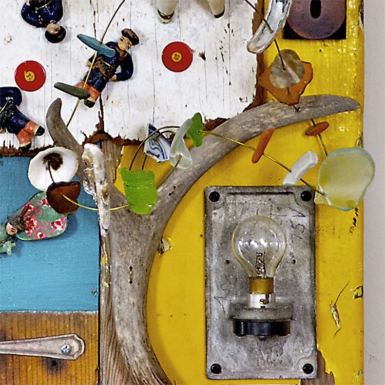
A deer antler found in the Mendocino back country became the tree. Holes drilled through the prongs allowed a spiral of wire to be added decorated with sea-glass and pottery-shards. Three randomly found pieces of wood painted yellow, green, and white became the sunlight, earth, and sky. A dog’s lost blue chew toy became the sun. A piece of an old auto found in the hills outside Durango became the partial moon occluding the sun. An antique flow light became the life-force source. A random set of painted, unfired clay figurines found at a salvage yard became sprites. A wooden winged angel made in India and found on our sidewalk after Christmas became the life force rising. A fork joined by a sea-worn pottery shard became a play on tree fork and manna. Lastly, a wood-type 8 stands for the infinite force of life.
BUMFUZZLED

My love of American comic strips got the better of me on this project. I’ve long been fascinated by the ability of cartoonists to capture human emotions in line and gesture. A few well-placed lines and you have anger, fear, joy, or confusion. I created a stage on which I could display characters from many of my favorite comic strips, old and new. I liked the idea of creating a 3D space in which these 2D figures could interact. As a background, I first thought to reproduce the original Tide Laundry Soap orange and yellow bullseye, thinking to play off the idea of myself awash in a comic interlude. The tagline changed, but I kept the bullseye to add color and animation behind my black and white tableau. To give the piece focus, I centered a photo of myself with clown nose.
FREQUENT FLYER

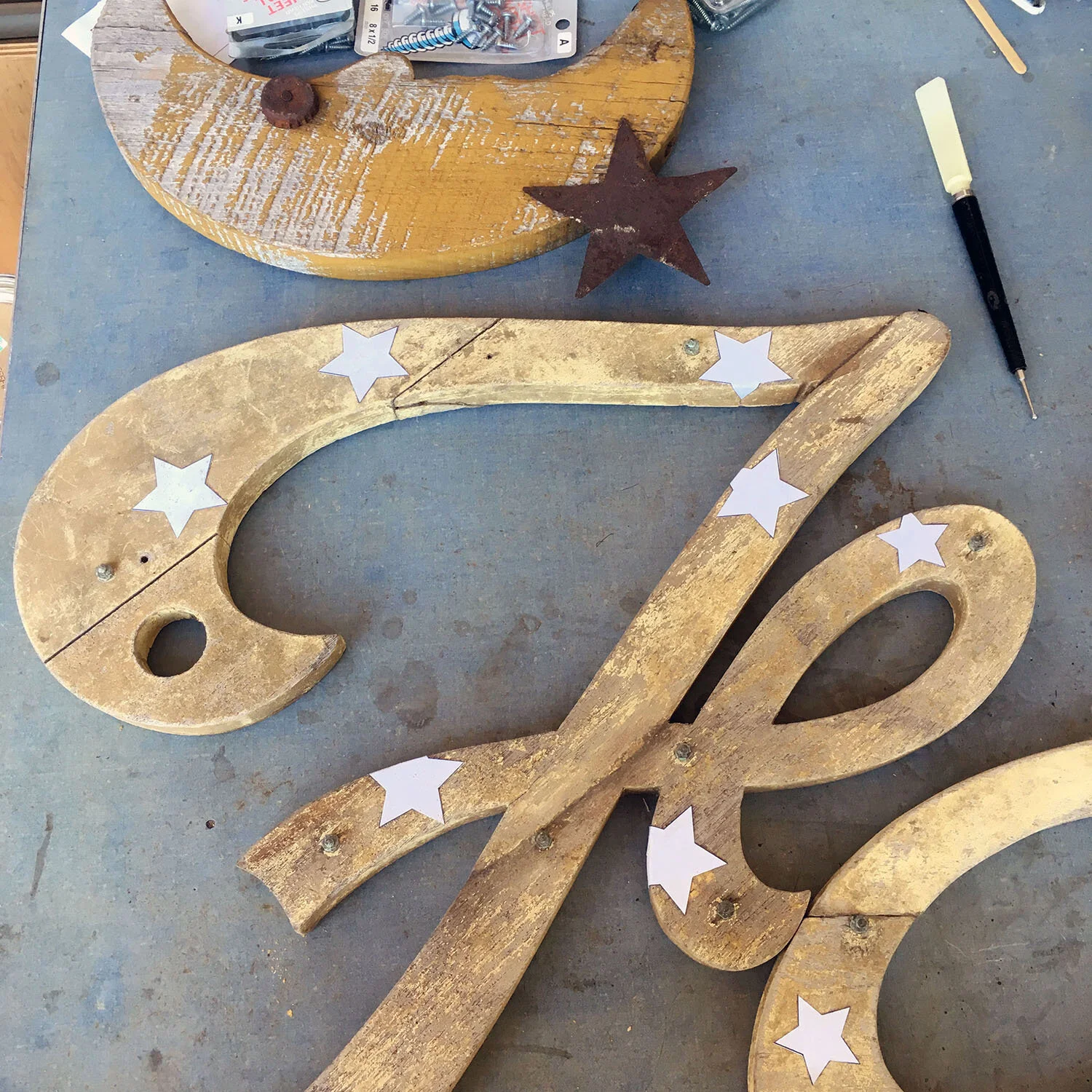
Instead of planes or people waiting in lines, “flyer” brought to mind the American flag, stars, a moon, and a cow. I’ve loved the design of the American flag ever since I had to pledge allegiance to it – the colors, stripes, and blue field of stars. I modified a piece of wire mesh and wove in canvas strips cut from a painter’s drop cloth, some were left natural off-white, some spray painted red and blue, with stars masked out of the blue. I attached the weathered quarter moon and rusted star to add character and give a nod to one of our country’s greatest accomplishments. With the moon came the cow jumping over it, another nod to our frequent flyer astronauts. The large lettering was a gift from a friend – a damaged old hand-cut wooden sign that I modified to “fly.”
DREAMTIME

This is a portrait of my oldest son, Aaron, an artist in New Orleans. He sells his work on Jackson Square in the French Quarter. He and I are also working on a series of children’s books featuring his dinosaur characters. His choice to move to New Orleans and develop an art career struck me as an excellent subject for DREAMTIME. I carved and painted his face in wood, and added some of his creativity and a sense of New Orleans by using images he created. I loved the playful rendering of New Orleans houses I’d seen in his art and book projects, and asked him to create a circle of houses. Our joint book process has him writing the story and drawing the art in black line, and my doing the layout and colorization. The dino characters are from our first book DiNOLA.
KERFUFFLE

A disturbance, fuss, or commotion, kerfuffle reminded me of shuffling cards and brought to mind the scene in Lewis Carroll’s Alice in Wonderland where Alice is attacked by the Queen of Hearts’ playing-card minions. I selected John Tenniel’s illustrations of Alice and the Queen, but preferred Disney’s Cheshire Cat. All the images were found on the Internet in black and white, needing to be reworked and colorized in Photoshop, printed, and mounted on sheet metal. I utilized the clockwork box of a defunct English school clock as my stage. It had a pendulum door on the bottom and a rewinding door on the right side. These openings allowed me to have the Queen and her cards attack Alice from multiple directions, and the pendulum door double for the rabbit-hole through which she falls. Figuring out how to softly bend the resilient steel wires I used to support the cards, and attach them to the box from multiple directions was challenging, as was attaching the cards to the wires in a way that gave the illusion of them flowing.
DAYBREAK

How about night into day or a sunrise? No. Maybe an image of a rooster crowing up the sun? I found a rooster crowing online and made several screen captures as a painting guide. The night-to-day cycle made me want to work the piece into a circular format. I selected the inside of a small metal garbage can lid and painted the rooster on a cut-to-shape piece of pine, making it easy to trim and curve the edges as needed. I added a wire mesh to mount stars on, spray painting it to match the sunrise colors sprayed into the inner lid. To complete the piece, I developed an arc of letters spelling Cock-a-Doodle-Day (playing off Doodle-Doo) I enjoy using letters in most of my assemblages, a carry-over from my graphic design. Nothing seems complete without type.
PALINDROME

A word or phrase reading the same backwards or forwards. I chose STACKCATS. I found several cat images on the Internet and created six layers of cats, extending them out from a piece of old, pink wainscoting found in a neighbor’s recycling. Each cat was printed on archival paper, mounted on sheet metal, and hand-cut to shape. By layering them, I could allow cat parts to peek out from the pile - a face here, a tail or paw there. As the layering progressed, it definitely took on the aspect of a hat like a Russian Ushanka cap or British Bearskin helmet, so I decided to insert my head into the assemblage and make it a self-portrait. I added a banner with STACKCATS above the cat pile to help make sense of the image.
A LIQUID

Liquid metaphors sloshed around in my head for several days. Nothing felt doable until I remembered the large glass neon “a” I had stashed away. I decided to play with the two words rather than depict a liquid. I needed a way to mount and display the fragile glass “a,” and something to act as liquid. Years before, I had found a half-circle of a large, three-inch wide, blue plastic water pipe left after a municipal construction. It was 24” in diameter and very dense. I realized that if I turned the arch upside down, I had a blue bowl of liquid. I created a wire arch and added it to the blue base. I suspended the “a” from this arch using thin black wire, letting the wire stay a bit loose and wander vine-like along the glass body of the “a.” To finish, I created a leaf out of sheet metal, painted it, and added it as a life accent.
MIMIC

Something sharing an external resemblance. A chameleon came to mind. As a bit of whimsy, I decided to make it an unsuccessful mimic, perhaps showing the opposite colors to its background. Once I’d settled on a particular image of a chameleon and a leaf pattern, I played with colors, but eventually came to prefer keeping the background leaf pattern black and white so that I could extend leaves in color up from the background to match those that covered the chameleon’s body. Keeping in mind the idea of an unsuccessful mimic, I had it catch something inappropriate, like a balsa wood glider plane. I created one from sheet metal, mimicking one I found in a hardware store, but changing some of the decals. The tongue was the hardest problem to solve. I retrieved a piece of dried vine I’d found and, once painted, it looked very close to the real thing.
AMBIGUOUS (DR. QUANTUM)

My youngest son, Max, is a physicist specializing in quantum chaos theory. I couldn’t think of anything more ambiguous than that field of study. I had a good photo of him thinking, and a friend had just given me a ¾-inch thick circular piece of architect’s glass. I started with the idea of stenciling quantum notations on the outer surface of the glass and placing the Photoshop processed photo on the underside. Instead I placed the notations and letters loosely spelling QUANTUM CHAOS directly on the image and let the glass on top add a wavery depth to both. Additionally, I suggested his thought process by adding a flurry of imaginary, colorful quanta particles swirling around his image. The quanta are made from squiggles of wood left over from another project, sanded, painted, and wired on.
MONEY

Thinking of money as decorative rather than remunerative, I bought a few old coins at a flea market for 25 cents apiece, knowing that months earlier I had found a discarded roof tile in the rough shape of a long, narrow face, and the hand-wrought metal tines of a pitchfork. The two pieces made me think of a face with spiky hair or a headdress. Flea market pool balls became eyes, a discarded teakettle handle found on the sidewalk became the nose, and two electric burners from a hotplate became the ears. The cartoon-like mouth is a modified piece of vine that reminded me of smiling lips. The coins, a few beads, pieces of jewelry and sea glass, painted sheet-metal leaves, pottery shards and shells, and my grandfather’s Kiwanis button became the earrings and decoration for the headdress, attached with thin wire that wraps vine-like around the burners and tines.
ASSEMBLAGE
Assemblage is a creative gathering of disparate things – found objects, carved wood, paper ephemera, refrigerator letters, color, etc., assembled into an arrangement that makes sense to the artist. Being a lover of objects just for themselves, I had been gathering found things for years. When I started making assemblages, I assumed I would be digging through this gathering and combining some into new object-scapes. Instead, I discovered that I’m a storyteller with a streak of whimsy.
Many of my assemblages are not just made of found things. Many have underlying structural elements of wire mesh, hand-cut sheet metal, and plywood, surfaced with images researched online, things I carved out of wood, found objects, and handmade paper.
Another artist and I made lists of words and phrases we then used as a springboard to create. I recommend this method to anyone stuck creatively. Some of our words have been Tree, Kerfuffle, Liquid, Contradiction, and Palindrome. Once I have an idea, the fun is figuring out how to create the assemblage. Often, I have to resort to watching YouTube how-to videos in order to make something I couldn’t otherwise figure out.
BIJOUX

Something delicate and highly prized. A friend gave me a number of Native American pottery shards found hiking in Arizona. Some had bits of painted or textured design. I retold the story of their dispersion over centuries, having been discarded as trash and left in middens, which then wore down leaving shards spread down hillsides and deposited in arroyos. I created plateaus out of handmade paper and wire mesh to suggest Southwestern mesas. Then inset the shards, adding additional handmade paper in brighter colors to suggest water and vegetation. In the center, I placed an antique drawer with three of the best shards floated inside to suggest the collector’s gathering and love of these pieces.
CONFUSION

I remembered the jumbled thoughts and twisty fear that envelops me when I’m confused – something akin to a panicked animal in a cage. I enlisted a former squirrel cage to become my mental metaphor, and some twisted, compressed wire mesh became the trapped fear. I added “confusion” spelled in brightly colored plastic letters suspended in the interior mesh. To capture the sense of spinning thoughts and panic, I added an old butter churn upside-down on top of the cage, embedded wires in the top spindle mimicking a carnival ride octopus, and attached familiar cartoon faces displaying panic and confusion. The cartoons began as black and white images I then colorized, each in two contrasting, out-of-register colors, to enhance the sense of unsettledness. When the crank is turned, the faces spin wildly about.
FOOD FETISH

I love making pies. You gather and mix the ingredients into a new, one-of-a-kind structure, and then, bonus, you get to eat it – definitely a creative act worth honoring. I made the piecrust out of baker’s dough. Baked to wood-hardness, the baked look was added with acrylic paint. The pie tin and forks were found at a salvage facility. The alphabet blocks came from our grown children’s collection of toys. The red-and-white cloth wrapping the base is from a discarded kitchen tablecloth. I also developed an image of apple slices and attached it to the inside of the pie pan. The crust has the number Pi painted in white to honor our sons – one a physicist who loves mathematics and memorized a long string of Pi digits in elementary school and the other an artist who was born on Pi Day (3.14).